In order to help tracking the COVID-19 pandemic we have developed a series of Python 3 scripts that gather epidemiological data from different online sources and plot diverse graphs and maps.
The scripts are fully automated and the daily updates also occur automatically.
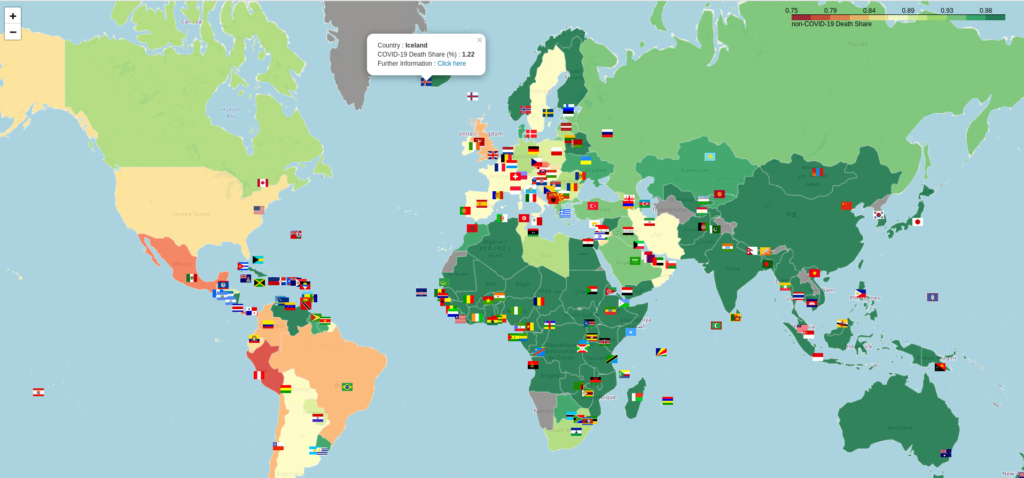
EXCESS DEATHS
The following interactive map represents a worst case scenario for excess deaths. The actually figures are therefore overestimated (for instance, they should be negative for Finland, Denmark, Norway and Iceland but they are slightly positive). What matters is the relative differences between countries.
DEATHS PER MILLION: TIME EVOLUTION
Time evolution of deaths per million attributed to COVID-19 for countries with a ratio higher than that of Germany.

DEATHS PER MILLION: WORLD MAP
Click on the image for an updated interactive version of the map.
Click on the pins for quantitative information.
Pink pins indicate countries where the Head of the Government is a woman.

DEATHS PER MILLION: EUROPEAN REGIONS
This map is absolutely unique in the world. At the time of this writing, nobody else was providing this kind of information.
Hoover over the regions (or click on them on the mobile version) for region names and quantitative data.

DEATHS PER MILLION IN WESTERN EUROPE : VIDEO MAP
We have mapped the relative mortality attributed to COVID-19 in western Europe at NUTS3/NUTS2 granularity overtime and created a video.
Interactive maps for the first and second waves are also available.
CODE AND RAW DATA
The code, raw data and outputs are available in our Google Drive.
If you use it, fork it or distribute it, we would appreciate if you could drop us a line just to let us know.